Table
Tables organise and display information from a data set.
How to use Tables
Use tables to make information easier to compare and scan for users.
When using tables:
- List your items in a clear way, whether it’s alphabetical, numerical, time-based or some other logical order
- Complex tables may require more explicit cell and header associations using scope, id, and headers attributes
- Provide a summary for complex tables describing how the data is organised to help users understand and navigate the table
Types of table cells
A table is built using two cell types, a header cell and a table cell.
Header cells
Header cells are used to tell the user what every row and column is showing within your table. Header cells can be used in horizontal format (row) or vertical format (column) to build a table.
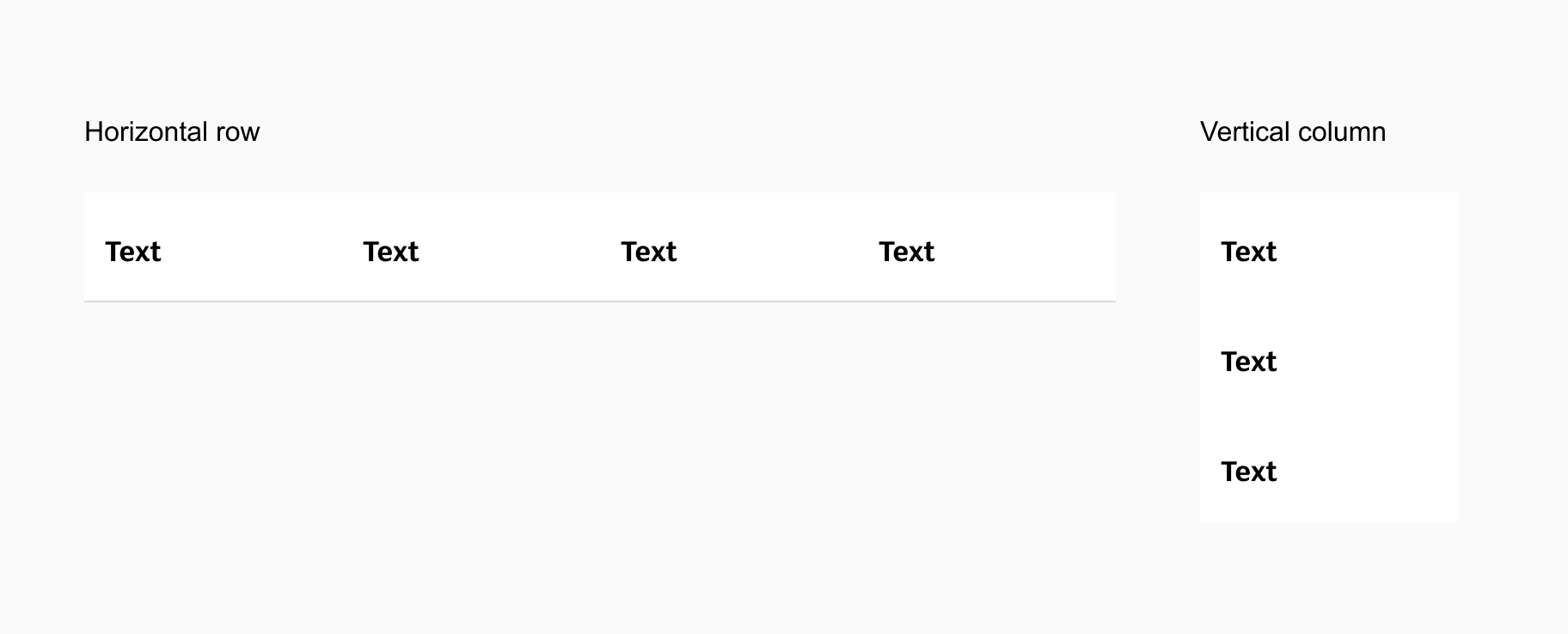
Table cells
Table cells are the building blocks designed to help you build data tables with content.
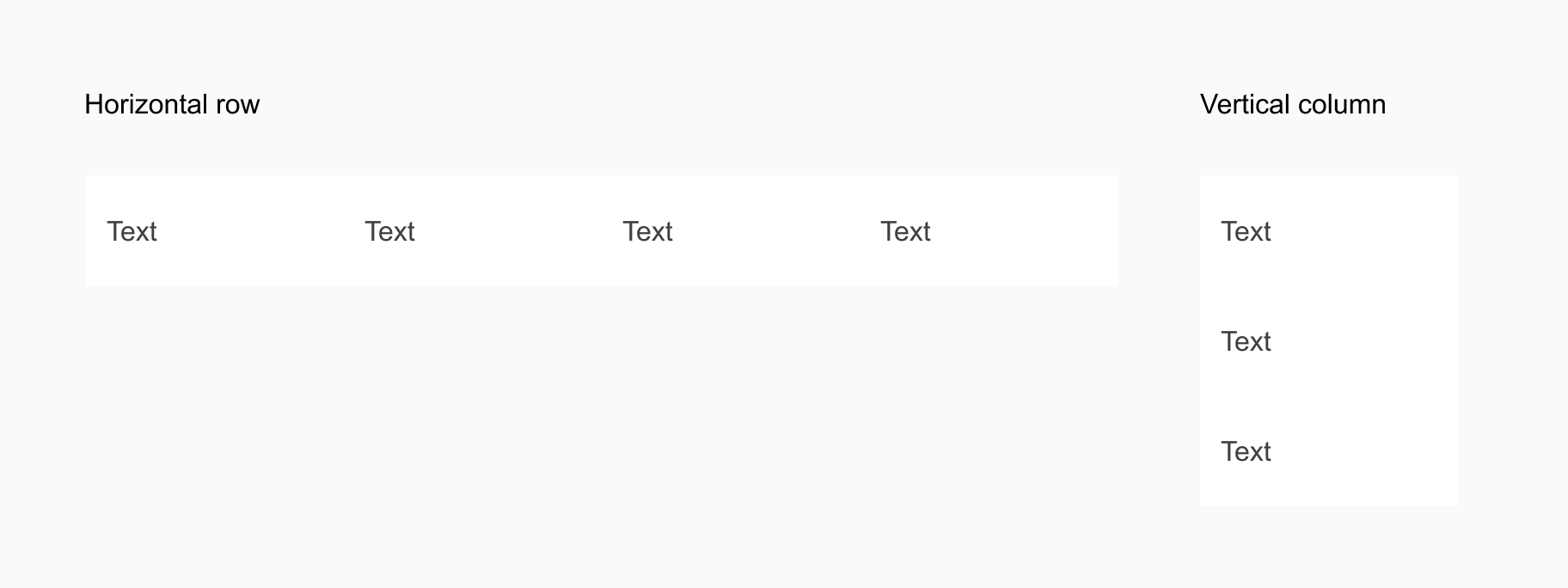
Table cell colours
Table cells can be designed using zebra stripes to help differentiate your data and make the table easier to read.
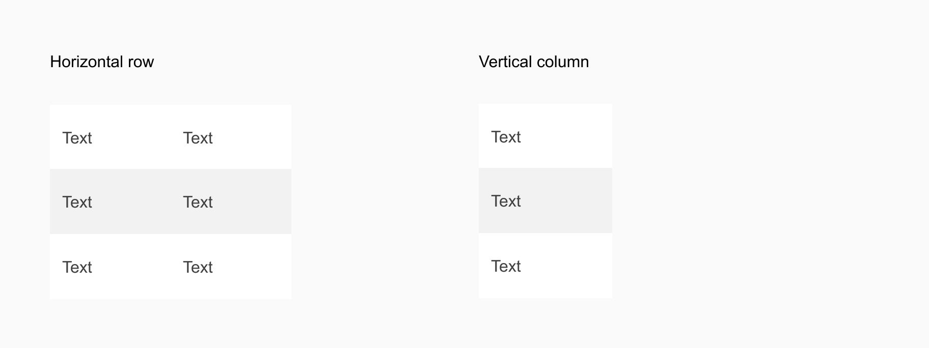
Table cell & header cell alignment
Header cells and table cells allow for alignment for the elements within each cell. This allows you to adjust the layout of your rows and columns to best reflect the data type and format within each cell.
Alignment options within cells are:
- Left
- Center
- Right
Styles of table cells
Header cell styles
Elements and states can be edited within each header cell.
Text only

Icon only

Icon & Text

Checkbox

Table cell styles
Elements and states can be edited within each table cell.
Text only

Icon only

Icon & Text

Checkbox

Button

Radio

Input

Switch

Link

Tag

Image

Swap Instance
Text indicators and supporting text options
There are three types of text indicators that you can apply to your table interface patterns which are:
- A label to indicate the name of the table and its purpose
- Supporting text to provide additional information or instructions about the table
- Captin text that can be added at the base of tables
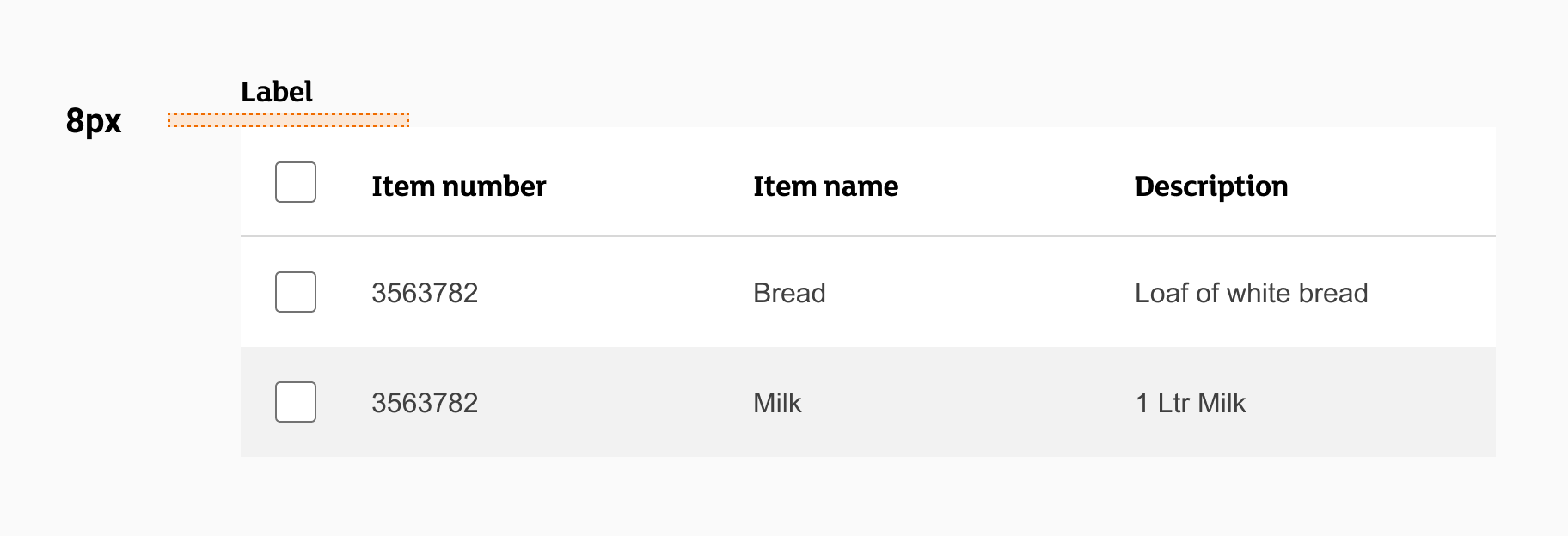
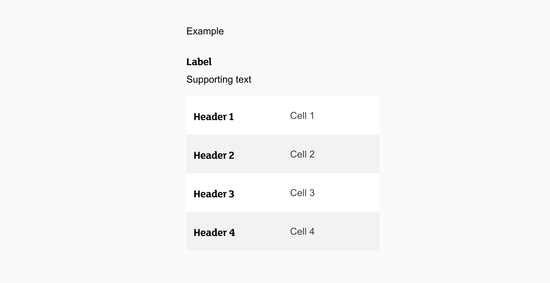
Label example
When using a label:
- Always left align your label above the table.
- Spacing between the table and the label should be 8px.
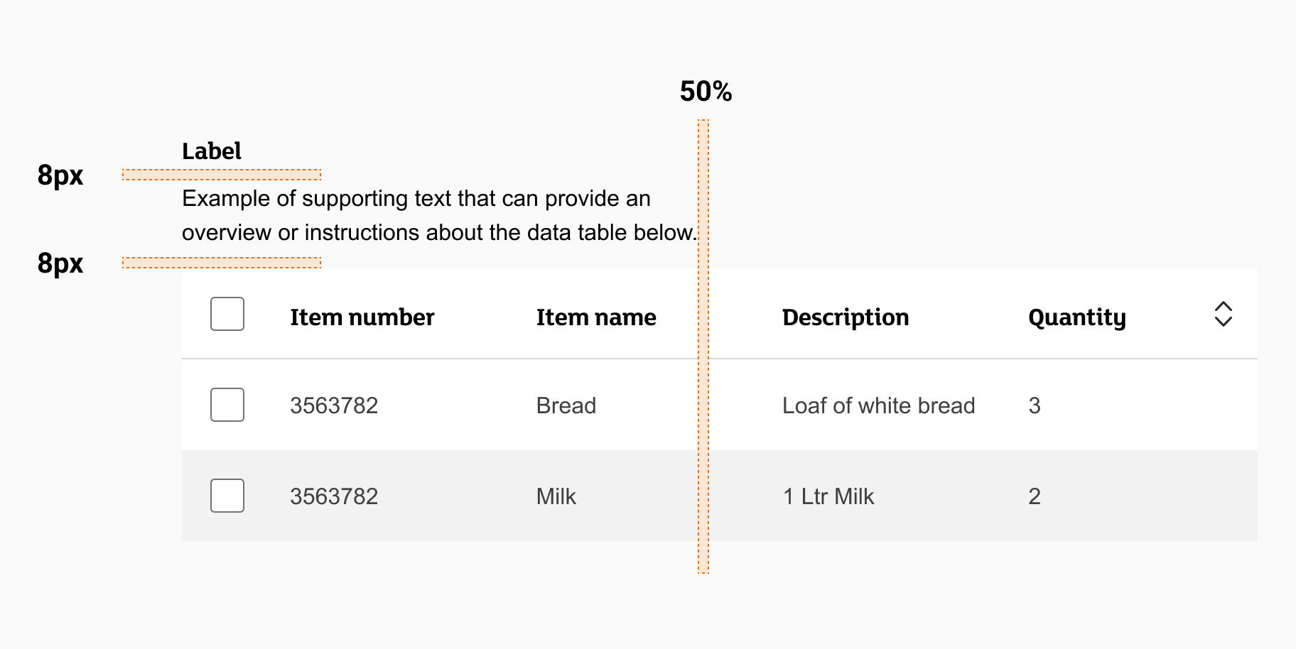
Label with supporting text example
When using supporting text with a label:
- Always left align your label and supporting text above the table
- Spacing between the table, the supporting text, and the label should be 8px
- keep the length of your supporting text to less than 50% of the width of your table in most cases, unless the table is on mobile and you can use the full viewport width
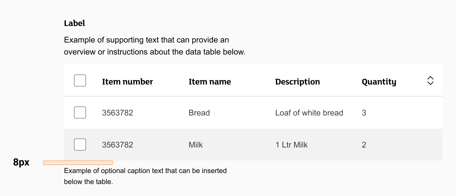
Caption text example
When using caption text:
- Always left align your caption text with the table
- Spacing between the table, the caption text should be 8px
- Keep the length of your caption text to less than 50% of the width of your table in most cases, unless the table is on mobile and you can use the full viewport width
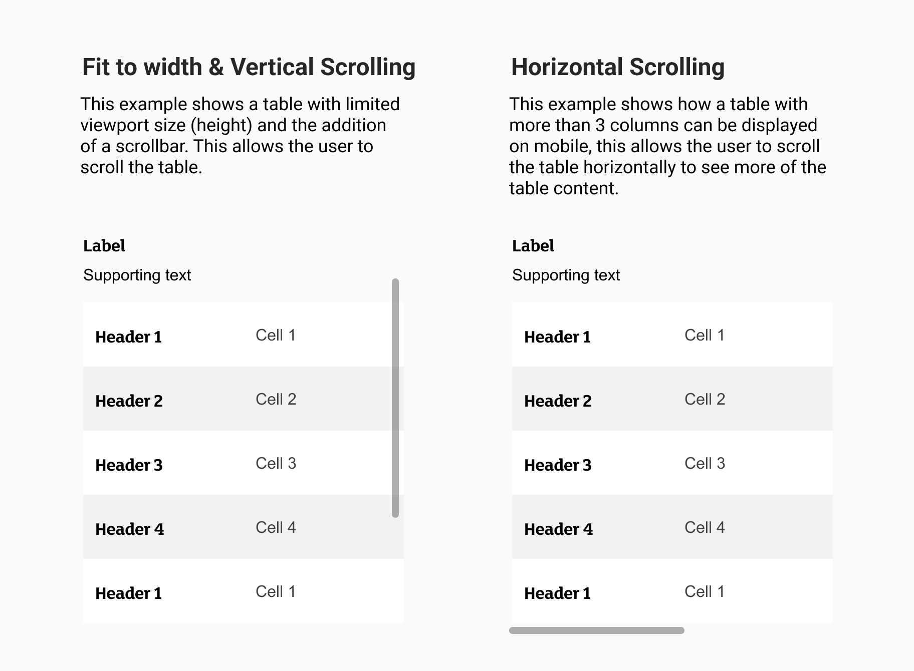
Tables for mobile
For mobile table used there is a naturally smaller viewport on width. For this screen size you can use the cell type ‘Row = Header + Cell’.
Displaying table content on mobile devices
There are of course restrictions due to the smaller screen size which limits the amount of columns you can use. It is suggested to keep tables for mobiles to a 2 column split so that content does not look squashed and would potentially become unreadable.
If the content of your table involves many rows and columns of information the following scrolling mechanisms (Vertical & horizontal) are recommended.
Content guidelines
When writing content for tables:
- All labels and headers should be informative and descriptive
- Include unit of measurement symbols in the header so they aren’t repeated throughout the columns
- Use decimals consistently
- Start your headers with a capital letter
- Don’t use commas or any punctuation at the end of each header
- Don’t use more than three words per header