Product card
A product card allows the user to view all the important information about a product in one place.
How to use a product card
Product cards provide users with all the important information about a product so they can make a considered decision.
When using a product card:
- As a minimum the product card should contain an image, description and price
- Add further detail by using colour variants, brand logos, review ratings, or other information to help browsing and comparison
- Use buttons on product cards to encourage an action
Types of product card
The product card comes in horizontal and vertical formats.
Horizontal
Below is an example of the horizontal product card. This is responsive and can be used for web or mobile.

Vertical
Below is an example of the vertical product card. This is responsive and can be used for web or mobile.
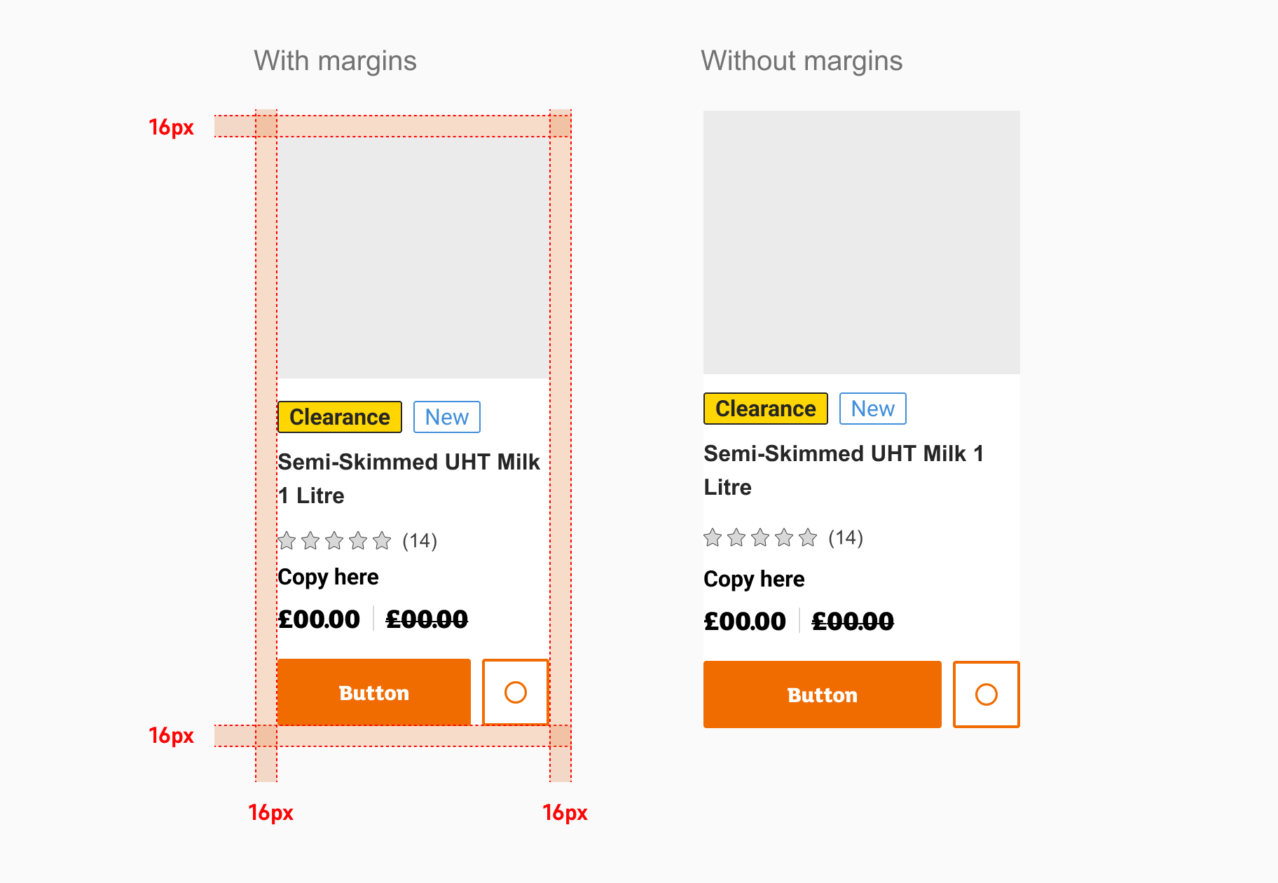
Cards with and without margins
Both horizontal and vertical cards can be used in layouts with margins and without margins.
Elements within a product card
Below is an overview of different types of elements used in a product card.
Image
The image area is used to showcase a picture of the product, images should be clear not pixilated and not crop the product. Use swap instance to insert your image correctly.
Promotional badges
Badges can be used in product cards to highlight special features of the product you are highlighting.
- clearance
- new
- badge
- badge
- badge
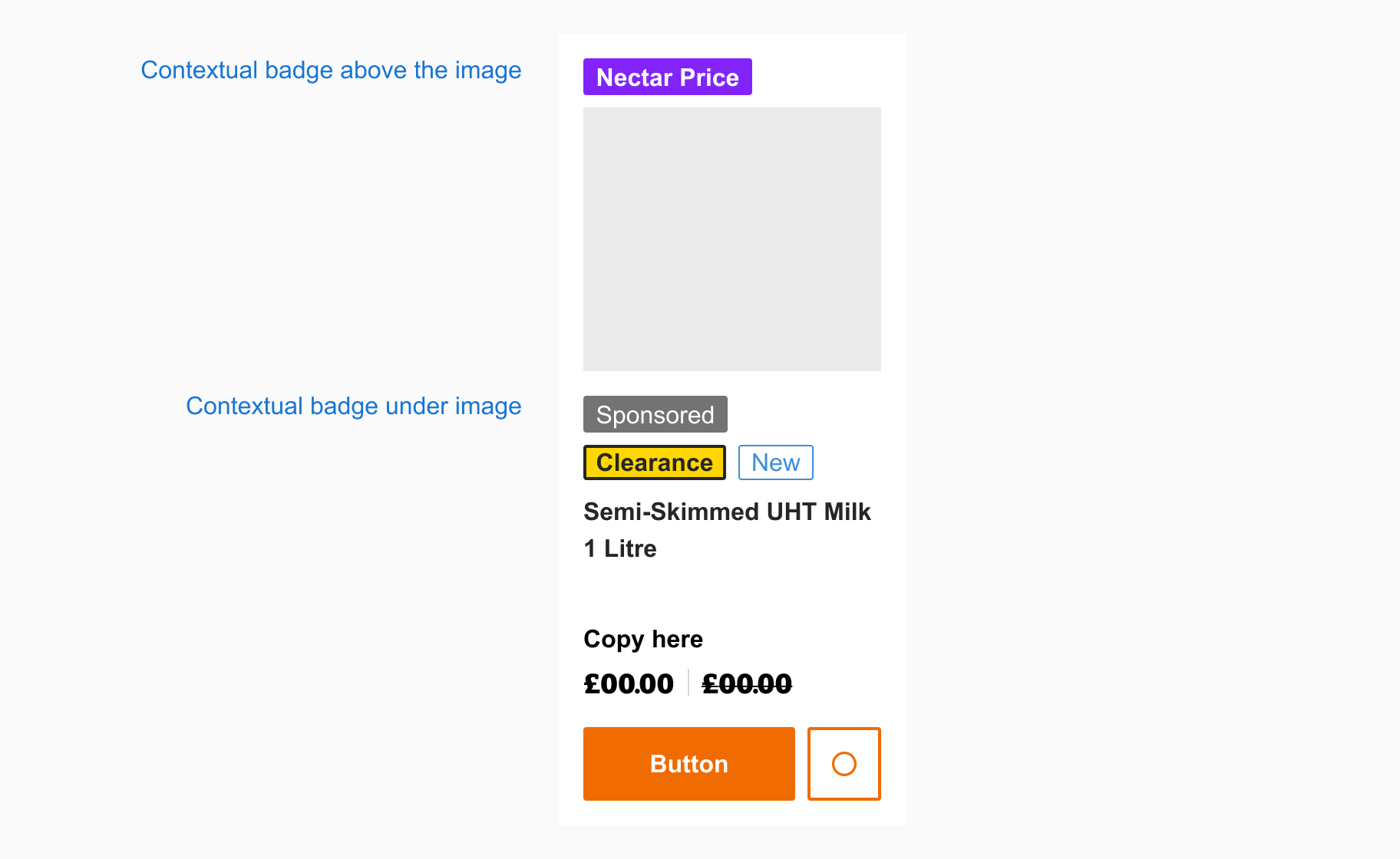
Contextual badges
Contextual badges allow you to highlight products that have a ‘Nectar price’ available or the product on display is ‘Sponsored’. These contextual badges are built so that you can display either the ‘Nectar Price’ or ‘Sponsored’ badge above the image or below the image.
Description
The description area is used to convey the name of the product and key highlights.
Ratings
Typically five stars and a numerical value assigned to the quality of the product.
Unit price
The product price can be shown in a variety of ways that include unit price, sale price and with or without loyalty points.
Button
If you need to link your product card to a product details page. You can do this by including a button at the base of the product card. Buttons let users take actions or make choices with a click or tap.
Icon Button
You should only use an icon button when the context makes it completely clear what the button's for, usually in the case of using an icon button ona product card could be for example a wish list.