Modal
A modal, also known as a Dialog, is an overlay that requires users to take an action or gives them urgent information.

How to use modals
Modals are used to focus the user’s attention on a single task or an urgent piece of information. As modals are disruptive to the user's experience, they should be used sparingly.
When using modals:
- Use them sparingly as they are disruptive to the user’s experience
- Both the title and the button should reflect the action that will occur
- Provide context to screen reader users by announcing the modal using when it’s opened
- Only give a single piece of information or require a single task to be completed
Use a modal
- When requesting information that is preventing the user from progressing through their journey.
- To notify the user of important information relating to their journey like system errors.
- To confirm user actions and explaining the potential consequences of those actions.
Don't use a modal
- For non-essential information.
- When the user requires additional information to make a decision that is unavailable in the modal itself.
- For actions or tasks that need to be performed quickly as they disrupt the core journey.
- If the content can be displayed in a less intrusive way.
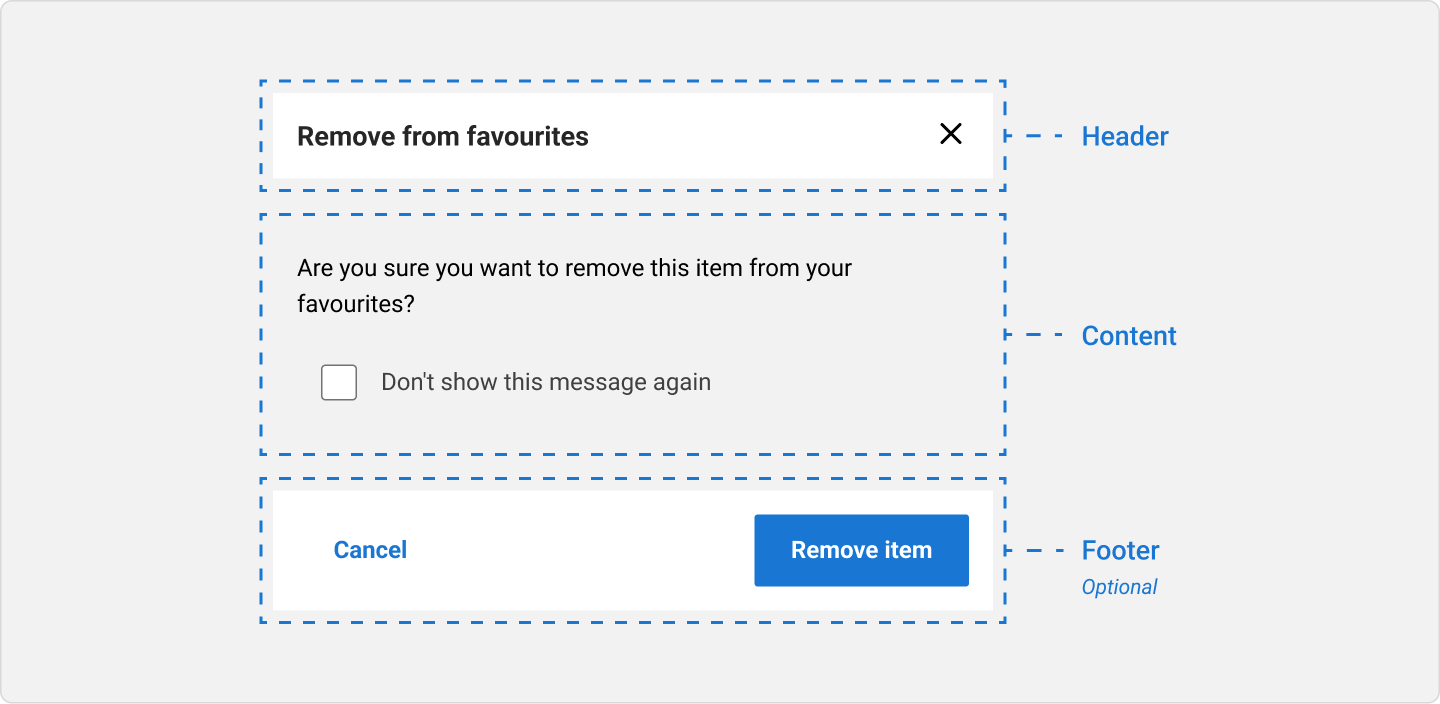
Anatomy of a modal
A modal can include the following:
- Header: includes a title, supporting text, leading icon, and a dismiss icon button.
- Content: contains the content and/or controls needed to complete the modal’s task. It can include text and/or components.
- Footer (optional): contains the primary actions needed to complete or cancel the modal task.
- Blanket: a tinted transparent overlay that deprioritises the page content underneath the modal.
Usage guidelines
Avoid nesting modals
Modals are designed to be interruptive, ensuring that a resolution is met at a particular point in time. Therefore, it's important that only one is used at a time and they are not stacked.

Content guidelines
Headings
All modals must have a title, one that is descriptive and clearly communicates the primary message in the modal.


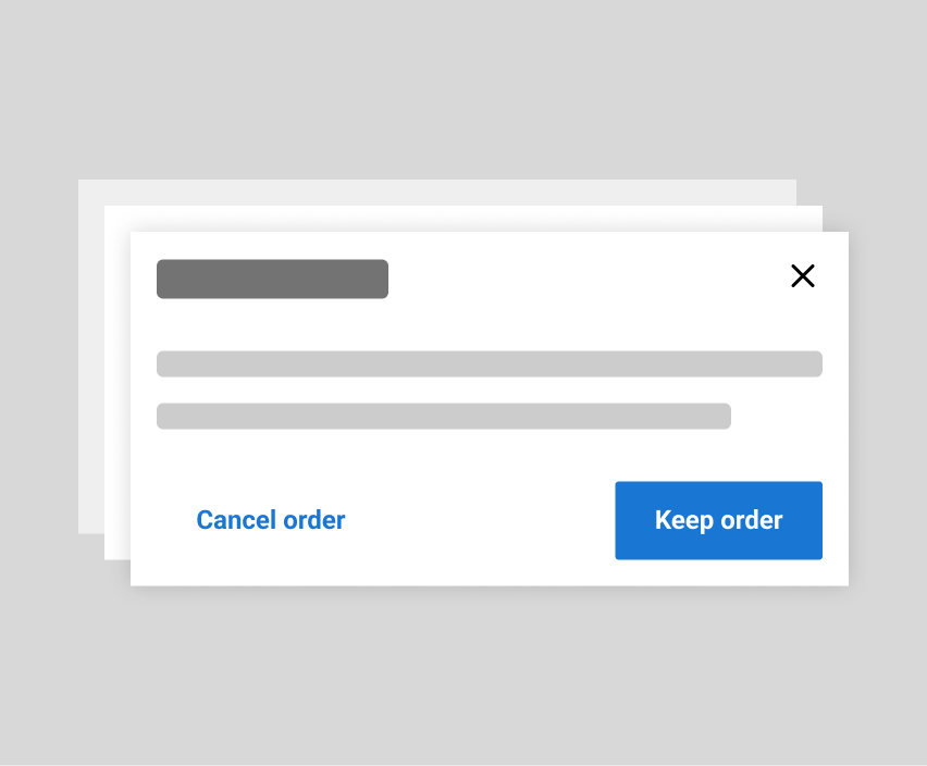
Actions
When using buttons with modals, the button labels should make it easy to understand what will happen if the button is used.
For example, if a user is cancelling an order, make it clear how they can confirm the cancellation with your button labels. It should be clear which button is confirmation and which is cancellation through your labels.

Accessibility
Aria
Using the aria-modal attribute tells assistive technologies that the windows underneath the current modal are not part of the modal content. This places focus only on the modal content, until it's dismissed.
Focus Considerations
When a modal opens, the modal container receives focus. The objective of this is “focus trapping”, which allows the user to tab through modal content without the risk of falling out of it’s tab index.
Keyboard Navigation
Keyboard navigation is important for helping users who do not use a mouse or pointer device. All interactive elements like links, buttons and controls must be able to receive focus and be operable using standard keyboard controls.
Tab: Moves focus to next focusable element inside the modal. When focus is on the last focusable element in the modal, moves focus to the first focusable element in the modal.Shift+Tab: Moves focus to previous focusable element inside the modal. When focus is on the first focusable element in the modal, moves focus to the last focusable element in the modal.Escape: Closes the modal.